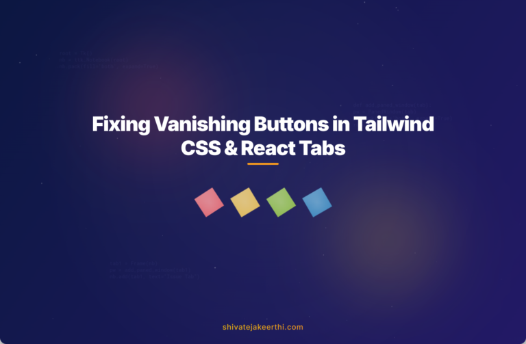
When building intuitive Tabbed UI interfaces, buttons play an essential role. However, a common snag occurs: buttons mysteriously disappearing right after the page loads. This issue is notably prevalent when using Tailwind CSS and React. If you’ve encountered vanishing buttons in your tabbed user interface, you’re not alone. Let’s explore the cause and how to effectively solve this perplexing problem.
What’s Happening When Buttons Disappear?
You’re excited to see your beautifully styled Tabbed UI, you refresh the page, and… buttons vanish from sight. Instead of seeing clear tabs such as “Alpha ESS” or “GivEnergy”, you encounter blank spaces or invisible buttons that only show up upon hovering.
This issue often arises from conflicting CSS or a misconfigured Tailwind CSS setup. In React-based projects, component-specific styles or global CSS modifications might inadvertently hide your buttons.
Taking a Closer Look at the HTML Structure
Begin troubleshooting by examining the HTML structure inside your index.html. This file typically sets the foundation for your React application, and by extension, your Tailwind styles.
Ensure your file properly integrates Tailwind and React scripts. A common setup looks like this:
<!DOCTYPE html>
<html lang="en">
  <head>
    <meta charset="UTF-8" />
    <meta name="viewport" content="width=device-width, initial-scale=1.0" />
    <link href="./dist/output.css" rel="stylesheet">
    <script src="https://cdn.jsdelivr.net/npm/react@18/umd/react.development.js"></script>
    <script src="https://cdn.jsdelivr.net/npm/react-dom@18/umd/react-dom.development.js"></script>
  </head>
  <body>
    <div id="root"></div>
    <script src="./src/index.js"></script>
  </body>
</html>
Confirm that your Tailwind stylesheet is correctly linked and the React container element (usually #root) is properly set.
Tailwind CSS: Checking the Configuration & Styling
Next, review your style.css. With Tailwind, the styles are usually minimalistic yet powerful:
@tailwind base;
@tailwind components;
@tailwind utilities;
Check for any custom classes that might affect button visibility. For instance, a hidden text color or high opacity can mistakenly cause “invisible” buttons.
Also, reassess your tailwind.config.js and postcss.config.js files. They manage your project’s styling consistency and Tailwind settings. Ensure your config aligns correctly with your project’s setup. Issues can emerge, especially if you’ve recently upgraded packages or modified Tailwind configurations.
A correct Tailwind config file typically appears as follows:
module.exports = {
  content: ["./src/**/*.{js,jsx,ts,tsx,html}"],
  theme: {
    extend: {},
  },
  plugins: [],
};
Misconfigured content paths often result in Tailwind classes not loading correctly at runtime, making buttons and other UI elements disappear.
Identifying the Problem in React Component Styles
Buttons disappearing upon page load often hints at styling conflicts within component-specific CSS or class application. For example, maybe your active tab class looks something like:
.tab-button.active {
  color: white; /* Possible conflict here */
  background-color: #0ea5e9;
}
If your buttons use the “text-white” class from Tailwind but the component’s CSS rules aren’t properly applied at runtime, the button text could blend into the background. This can trick you into thinking your buttons have disappeared entirely.
Troubleshooting in Visual Studio Code
Start by verifying your Tailwind installation using:
npm list tailwindcss
Follow these steps:
- Verify Tailwind and PostCSS installations.
- Ensure intimate compatibility with React version.
- Check warnings—any message about Tailwind directives like “@tailwind” could point towards the solution.
Warnings are valuable clues. For instance, a common one pertains to PostCSS setup or incorrect Tailwind syntax within your CSS files.
Revamping the Button Styling
Usually, fixing this issue involves fine-tuning button styles. Try explicitly setting contrasting colors or removing redundant styles:
<button className="tab-button active bg-sky-500 text-white px-4 py-2">
  Alpha ESS
</button>
After adding the correct foreground text color, your buttons become visibly clear immediately. You should also verify class toggling logic within your components. Here’s a practical tip: test your buttons in multiple states, paying special attention to active vs inactive classes.
Enhancing React Components Structure
Further improvements typically involve leveraging React state management for tab controls. Consider this simplified sustainable solution with state management using useState:
import React, { useState } from "react";
import "./styles.css";

const App = () => {
  const [activeTab, setActiveTab] = useState("alphaEss");

  return (
    <div>
      <button
        className={`tab-button px-4 py-2 ${
          activeTab === "alphaEss" ? "bg-blue-500 text-white" : "bg-gray-200"
        }`}
        onClick={() => setActiveTab("alphaEss")}
      >
        Alpha ESS
      </button>

      <button
        className={`tab-button px-4 py-2 ${
          activeTab === "givEnergy" ? "bg-green-500 text-white" : "bg-gray-200"
        }`}
        onClick={() => setActiveTab("givEnergy")}
      >
        GivEnergy
      </button>

      <div className="mt-4">
        {activeTab === "alphaEss" && <div>Content for Alpha ESS</div>}
        {activeTab === "givEnergy" && <div>Content for GivEnergy</div>}
      </div>
    </div>
  );
};

export default App;
This structured method eliminates confusion, clearly defining active tabs through conditional styling and content rendering.
Putting It All Together and Testing
After refining CSS and React components, ensure you thoroughly test across different scenarios:
- Reload pages and test different browsers.
- Interact with all tab buttons.
- Confirm consistency in button visibility and behavior.
Comprehensive testing ensures your UI functions correctly, giving users a smooth interactive experience.
Key Takeaways from Solving the Issue:
- Ensure proper configuration of Tailwind and CSS file inclusions.
- Avoid conflicting CSS rules by clearly defining active/inactive button styles.
- Consistently verify React component logic for correct class toggling.
As you continue improving your UI development practices, keeping these points in mind can save considerable effort in troubleshooting similar issues.
Further reading and resources:
Always keep these resources handy when resolving styling or visibility problems.
Looking to enhance your React and JavaScript skills further? Browse more in-depth articles in our JavaScript category.
Have you encountered button visibility issues before? Share your own experiences or questions below—we’d love to hear from you!
0 Comments